ONYX'AS – MORE THAN A BRAND,
A NEW ERA BEGINS

Brand Statement
The new ONYX'AS identity represents more than a visual evolution—it marks a strategic transformation. This rebrand has been carefully crafted to reflect a bold vision: to challenge convention and shape the future of the beauty industry through innovation, precision, and confidence.
The Logo
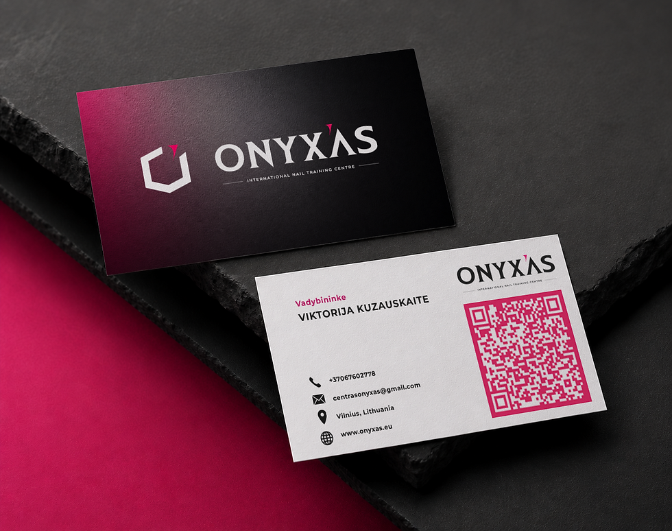
The logo is designed as a symbol of strength and refinement. Clean, sharp angles convey precision and expertise, while the dynamic form reflects forward momentum. The signature pink accent introduces a distinctive energy—bold, confident, and instantly recognisable—capturing the spirit at the core of the brand.
The Colour System
The colour palette is intentional and expressive. Deep black communicates resilience, authority, and sophistication. In contrast, the vibrant pink injects creativity, passion, and modernity. Together, these colours create a powerful visual balance that defines ONYX'AS as both strong and progressive.
A Strategic Shift
This identity goes beyond aesthetics—it is designed to create a connection. It embodies the brand’s ambition to inspire, engage, and lead. Every element works together to communicate a clear message: ONYX'AS is setting a new standard within the industry.
This is not simply a rebrand—it is a repositioning. A statement of intent.
ONYX'AS is built for those who challenge limits, embrace innovation, and lead with purpose.
Bold. Visionary. Unstoppable.


The Story Behind ONYX'AS
The name ONYX'AS is inspired by the enchanting Onyx stone, whose origins are steeped in mythology. The word "Onyx" derives from the Greek term onux, meaning “fingernail.” According to Roman legend, Cupid clipped the fingernails of the goddess Venus as she slept, and the Fates, to immortalize every part of her divine beauty, transformed those clippings into stone. This timeless tale mirrors the essence of ONYX'AS – a brand that seeks to preserve and celebrate enduring elegance and strength.
The typeface for the logo, Empire, was chosen with intention. Its bold forms and classic lines draw inspiration from Roman typography, evoking the grandeur, precision, and power of Roman culture. This connection underscores the strength and sophistication that define the ONYX'AS brand identity.
Finally, the addition of “-as” at the end of the name reflects Lithuanian grammar, proudly showcasing the company’s roots and heritage. This thoughtful blend of myth, history, and local identity makes ONYX'AS a name that resonates with both meaning and purpose.

ONYX'AS Primary Mark
The primary mark of ONYX'AS is a harmonious blend of the letter "O," representing the brand’s initial, and the distinctive silhouette of the Onyx stone. Adding a vibrant touch, the Rubin red apostrophe serves as a key accent in the logo, symbolizing the brand’s individuality and uniqueness. Together, these elements reflect the essence of ONYX'AS – bold, elegant, and unmistakably distinctive.

Armor Wash
Hex: #030303
RGB: 3, 3, 3
CMYK: 72%, 67%, 67%, 87%
For headings and subheadings
EMPIRE
ABCDEFGHIJKLMNOPQRSTUVWXYZ
abcdefghijklmnopqrstuvwxyz
1234567890 ( & . , : ; ! ? * / _ - ' ")
White 000C
Hex: #FFFFFF
RGB: 255, 255, 255,
CMYK: 0%, 0%, 0%, 0%
Fo body text:
MONTSERRAT
ABCDEFGHIJKLMNOPQRSTUVWXYZ
abcdefghijklmnopqrstuvwxyz
1234567890 ( & . , : ; ! ? * / _ - ' ")
Rubine Red C
Hex: #CE0058
RGB: 200, 0, 88,
CMYK: 14%, 100%, 50%, 2%